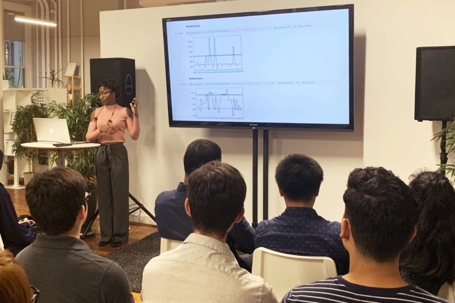
After applying and speed-interviewing for the Summer 2019 Hunter TTP Residency, I was matched to intern with Numina. My nine-week internship was full of individual and group work, from onboarding and stand-ups with the Engineering team every morning, to working on my own project. The onboarding meetings introduced me to the team and Numina’s technology stack, engineering practices, processes and workflow. I quickly grew accustomed to the office culture and felt at home. At the end of the first day, we, the interns had a brainstorming meeting with the CTO, to review a range of project ideas and selected those that reflected our unique interests. While the projects we chose satisfied Numina’s internal and product needs, they also granted us autonomy for learning and professional development based on our skills and passions.
Background
Numina collects anonymous data on how people and objects move through streets and public spaces. This data can be aggregated into object counts, which quantify how many pedestrians, bicycles, and vehicles pass through a space in a given time. I decided to work on a data science project which focused on detecting, visualizing, and flagging daily object count data that are considered outliers, based on historical statistics. Outliers are defined as the values that fall outside the normal distribution of a data set, often observed as higher or lower than an expected range of values. Identifying outliers helps us understand the nature of variability in a dataset in order to make data-driven predictions and decisions.
As a junior at Hunter College pursuing a double major in Computer Science and Linguistics and Rhetoric, data science allows me to apply my keen attention to detail, strong communication style, and passion for communicating high-level, abstract, ambiguous concepts, like data, with clarity. This project turned out to be an all-encompassing data science project which required statistics, mathematics, and machine learning techniques such as data cleaning, visualization, and categorization using sklearn, pandas, matplotlib and Seaborn.
Project
I worked with nine months of counts data spanning from November 2018 to June 2019 from a Numina sensor deployed in Golden Gate Park with the San Francisco Recreation and Parks Department. Due to events and recreational activities such as concerts and marathons, this site featured notable variability in daily count data. However, while we had an idea of when some events occurred, identifying (and being notified when) exactly when all variations occurred was an open question. This allowed my project to be a more open-ended exploration, which left more room for experimentation rather than checking tasks of a detailed project scope.
At Numina, I worked with Jupyter Notebooks, which opened a (useful) Pandora’s box of new tools and libraries including a Pandas, Matplotlib, and Seaborn. Before I could build a prediction model for outlier detection, I had to first learn how to organize the data so that it’s readable and explore it to find the right questions to ask.
Experimenting with different methods to identify outliers in our dataset, I explored statistical calculations of Interquartile Range, standard deviation offsets from the mean, and segmenting percentiles of the data. Beginning with the mean/standard deviation method, I printed and plotted the number of outliers using line graphs and presented these findings to the team. We concluded that this method may not be the most effective because the data doesn’t produce a normal distribution. Thus, we were left with new questions:
- How do we measure and visualize variability?
- Why do weekends have more variability than weekdays?
- Why is there variability on each day?
- What role do holidays/events play in variability?
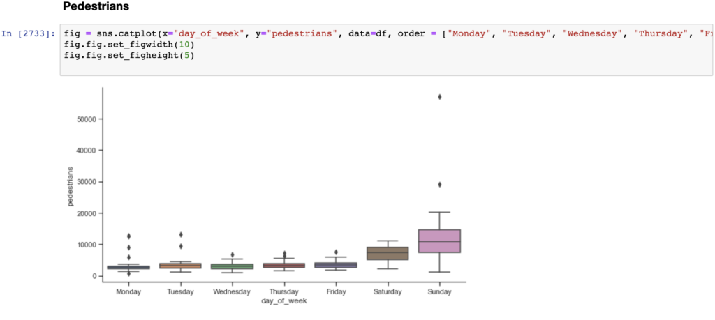
To answer these questions and/or develop new questions, I had to explore different ways to analyze and visualize the data. Therefore, in addition to the line graphs, I created categorical plots, including scatter and violin plots, histograms, box plots, and cluster plots of the counts for each method: mean/std, IQR, and percentiles (1st and 99th, and 5th and 95th).
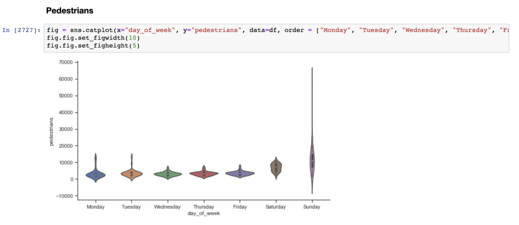
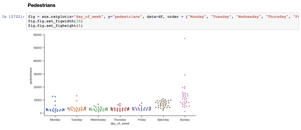
Similar to a box and whisker plot, the violin plot shows the distribution of data across days of the week. Unlike a box plot, the violin plot features a kernel density estimation of the underlying distribution. The scatter plot visualizes the distribution of data, while also showing each individual data point.
I spent my last couple of weeks at Numina extracting common functions and rewriting them in Python to make my code base cleaner and more readable. I also plotted the outliers for each method to do a side by side comparison and determined which method most efficiently detects outliers.
| Method | Monday Pedestrians | Saturday Pedestrians |
| 1st and 99th Percentile Outlier Detection | 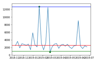 | 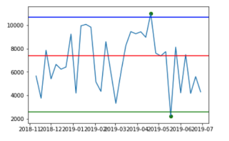 |
| 5th and 95th Percentile Outlier Detection | 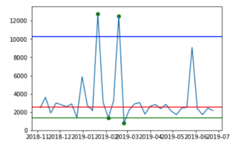 | 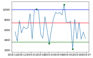 |
| IQR Outlier Detection | 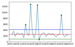 | 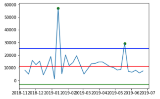 |
| Mean/Std Outlier Detection | 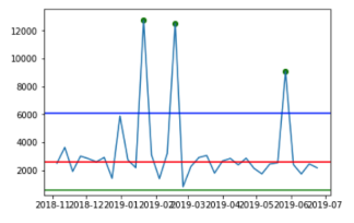 | 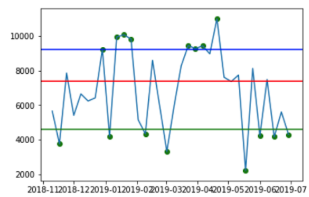 |
The green, blue and red lines represent the lower bounds, upper bounds and median, respectively. The green dots represent the detected outliers.
Takeaways
As I am nearing the final stretch of my internship, I still have many unanswered questions. However, what I love about data science is that the goalposts are always moving. Although you reach new conclusions and find better ways to deconstruct and concisely communicate insights from complex datasets, there is still a lot more to discover. Though I had my fair share of hair-pulling moments with Pandas and Matplotlib, my experience at Numina reaffirmed my interest in Data Science and Analytics. Some of the greatest challenges bear the most rewarding results. Since data is the bridge between analytics and creativity, the journey, though twice as challenging, is twice as rewarding. After interning at Numina, not only am I confident in my newly adopted skills, but more prepared to take on a career in this industry.